Monday, February 9, 2009

Transforming the ordinary


I am smitten by this new Japanese Masking tape available at DWR. I don't know how I missed it, but I must have it ( Thanks Jessicle for turning me on to it). The above image is from Jordan Ferney's awesome site, decor8 (see below for link). This tape exemplifies how something so simple, can be reinvented just by adding the emotional shift of color ( not any color Mr. 3M company - the perfectly right palette of color). No one is running out to by cobalt blue masking tape to create art with. No matter what you believe, color itself, is a powerful emotional driver, but like anything emotional, getting it right requires a sensitive understanding of what your consumer desires, this is not something that can be forced. Taste and style evolves phenomenally, not by dictation.

Apparently, artists wrote a letter to the President of Kamoi, the Japanese manufacter of a particular brand of crepe masking tape, to inform him that they desired more choice, more color, etc, since many designers in Japan were using their brand of tape for artwork. The company decided to release this set of 'designer colors' and now, nothing is the same.


Kamoi is an old company with an interesting heritage, they made sticky flypaper in rolls, which alone could be another opportunity in our 'green' world -even if they never redesigned the vintage packaging. Boy, I would love to get some of these authentic designs of Japanese fly paper, surely it would do well in the states, if released in both the vintage packaging, as well as in a stylish refreshed model. Again, more possibilities.

From the Kamoi Kokoshi Co. website, where there is an art gallery of work that designers have made with Japanese Masking Tape.

It's worth snooping around their website, even if you cannot read Japanese. See Kamoi Kakoshi LTD for more ideas.

Made from Washi paper, a Japanese rice paper, which is flat and tears nicely, this tape was first 'discovered' by some savvy trend hunters and creatives last year, such as on Jordan Ferney's blog Oh Happy Day, and the design blog decor8. Now the tape is available at Design Within Reach, and one size is already sold out so hurry!
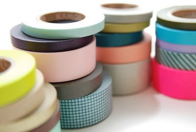


The manufacturer in Japan, has a website too, but apparently the links are not working, so I will not post it for now. Imagine the opportunities this simple color shift makes. I find it so inspiring, because now I want to walk through a Home Depot and look for other missed opportunities. There are so many places where one can still factor in design, to make the ordinary, extraordinary and desirable. Who would have thunk that a year ago,the idea the by simply changing the color of tape to a series of thoughtfully stylish palettes, could take something as banal as a roll of masking tape, and make it so desirable that it could become sold out on a global website.

Friday, January 30, 2009

Total Hydrocity - HYDRO74


I am continually impressed with the work of Hydro74, especially with their diversity - type, print, modern, classic, rough and tough, cute, edge, macho, feminine, but most of all, beyond trend. It's just one of those sites where on a Friday afternoon, I like to go and snoop around, to get stimulated. I mean, come on....how many firms can you name whose work actually looks more modern than what you could find at your local mall. Just check out the range of work here, then check their site.


THe design firm Hydro74, exists for one simple reason. They are extraordinarily talented, and continually impress clients, of which, they have many of the best ( NIke, Coke, Hasbro, XGAMES/ESPN, etc). Simple said, they do more than skulls.

Technorati Profile

Tuesday, January 6, 2009

Simply Different or Clinically Defaulted? Food Packaging Trends


Does Helvetica 'say'chips?, I wonder...... But this simplicity works for me.
(Although, I am not comfortable with the type face yet for 'Dill Pickle", maybe they are using the same 4/c packaging internationally, and adding the black plate later in some global efficiencies project? Who knows.? Aside from that, elegance is a great thing, I wonder how these redesigns will affect the competition, many of which are store brands who blindly mimic whatever the mega brand does. Trends are indeed, funny animals.


What are your thoughts on the new Pepsi logo?
Considering the older logos.........

I do love this.......but, of course, not everyone does. But all of this simplicity is interesting, but in a way, a logical next step, since we've tried everything else. So comes next, after simplicity and minimalism? A revisit to "classic"? Or do we start at the begining again with 'vintage' and nostalgic'?

It started a year ago, with Frito-Lay products, what at first looked like a default typeface, in it's Helveticaness, was, in fact, a new brand packaging design for the Lay's brand. Hmmm....Actually, although it captured my attention because it was different, it felt, a, bit,.......simple. Not that there is anything wrong with being simple, but....why simple?

Then....The Pepsi logo redesign. Which,frankly, I like. I had started to write an entire posting on what other people thought, but what's the point. Surely, enough has been said by its critics, and since I adore the work of the Arnell Group, and Peter Arnell, I can only imagine the intellectual work which went into this enourmous venture. Global brand identities rarely please everyone when re-designed, and, I think they shouldn't. because if the brand is successful, it is personal. Being personal aside, brands are also business, and there are good reasons why refreshing is often, needed.


Then......I was buying orange juice, and could not find my Tropicana.....
Now, this is interesting. Call it a trend, or call it change for changes sake.....I have to admit that there is little that I can say yet about the new Tropicana, brand identity. Although it is certainly different, it is confusing, even when I sent Joe or my 94 year old dad to buy juice, they either could not find it, or choose the wrong one. I would love to have seen the creative brief for this, certainly there was much work done, and I am curious as to what the goal was.

From what I can see, it may have been.

1. To appear more "European" (?) As if this was a Swiss brand (i.e. simple sophistication.
2. To appear less confusing ( Face it...Tropicana was suffering from over-brand-extentionism with it's pulp, no pulp, calcium, fish oil, Vit. C, Vit D. blah, blah, blah).
3. Maybe they wanted to appear more serious, although I am not sure that 'Pharmaceutical' was their intention.
4. Perhaps they just wanted to just simplify, and appear 'different' from the competition, which frankly was all starting to look the same.( influenced by vintage fruit crate labels with beautiful engravings, and wood typeography.)
5. Or, there was internal competition at Pepsico amongst Marketers, sort of a 'well, you changed your brand, so I am going to change mine" Which I doubt. But marketers can be quite competitive.


We all have to admit that Orange Juice line extensions were just becoming completely crazy in their variety. What could be next? PomOrangeAntiOxiMint? At least this simple design is consistent and it has great shelf presence, with its whiteness in the florescent glow of the refrigerator case, and it is surrounded by a virtual Kraft-ness of glossy, photos and stunning illustration of drippy, gooey fruitiness...., but it is this understated design effective in segmentation between flavors? Well, it takes a little work. I mean, I'm not that old, but I had to actually get my glasses, and I only have a stigmatism. Then, I helped the lady next to me find hers, but she still didn't believe that it was Tropicana brand, she thought it was the value brand. Which brings up another interesting trend - that of brands wanting to actually appear as if they are the 'value brand' or the 'generic brand"/ God, I hope that is not the case. I still can't understand why Sunchips brand redesigned their packaging to appear more "poorly designed", I can only assume that they felt that it looked 'more organic', with the logic that "organic brands are amateurish or at least naive in their appearance". Clearly, as a designer, I think about this things too much, no one wants to go shopping with me.

So, whether it was a shift to get more marketshare, or research driven, or simply a ballsy
Let's see what a redesign does for our brand?" decision, it is still, quite fascinating to see such a swing in style, to a rather, simple, clinical approach. Will it work? Well, it has to, but I still can't resist watching the consumers last Sunday at my local Price Chopper try and find their favorite OJ! That can't be helping sales.

Tuesday, December 2, 2008

Brands on Broadway


As a fan of great entertainment, where ever it comes from, ( and believe me, today, if often can only come from the mega-corporations such as Disney and other studios), I was not surprised to see that SHREK will be opening on Broadway next week. As other shows close, such as the BRIDE OF FRANKENSTIEN, which I love, others open in good, old fashioned Broadway tradition. The only difference is that today, it costs a whole lot more ( 30 Million dollars and up) to assemble the talent and to secure the space to put on a 'show'. As an entertainment/Intellectual Property creator myself, I know that this is a trend not going away soon. Admit it, you really are not surprised, either. Come on.....look at the movies lately? Everything is a remake. I can only hope that this is not some global sign that creativity is waning, hopefully it is only a slightly exploitive use of licensed properties, only because humans enjoy seeing thier favorite characters in other venues ( much in the same way I loved my Casper the Ghost pajamas in 1967).

BTW.....look out for Spidey on stage, the MARVEL character is being cast for...yes, a Broadway Musical opening next year. Don;t laugh, it might be awesome........the music is by Bono of U2 fame. It can't be THAT bad. Anything done right, can be extraordinary.

Wednesday, November 12, 2008

Idea Painter - Nikki Farquarson


Randomgotbeautiful.com by Nikki Farquarson


In our world of vintage-this and vintage that, I am always impressed with what elevates from the sameness. A recent post on the site THECOOLHUNTER.COM featured the illustrations of Nikki Farquarson, but she is much more than a mere illustrator with and undeniably fresh look - she is what I call a idea painter - visualizing new expressions out of most any material, regardless of any rules or limitations. I especially like her work on the site RANDOMGOTBEAUTIFUL.COM and her type which is hand executed.


Reminiscent of textbook cover doodles, Nikki's illustration demonstrates a rare gift today - a distinctive and authentic style that although influenced from the past, delivers newness. Call it collage, retro doodles or craft, I believe her work is nothing but pure genius because it takes me to an entirely new place, visually.

Tuesday, November 4, 2008

The technocolor world of Steven Wilson


"What Happened to the Future? 2008 © Steven Wilson

UK artist/illustrator/designer Steven Wilson has somehow managed to keep off of my radar, but just like many of the planets hottest creatives, he has already designed for global clients like Coke and Nike. His unique imagery takes the omnipresent vector and ornament look to a new level. I even must say that some of his earlier work ( the outline imagery below from 2005) is even more fresh feeling. The perfect example of creativity today as mash art. 80's, 90's, photography, RGB images, gradations, ornament, and a hefty dose of style make Steven's work incredibly new feeling. It's work like this that makes me want to design again. Invigorate yourself with the following from his portfolio.


Monday, November 3, 2008

Cross Influencing - Creatives share to achieve new expressions.

As one who is frequently called upon to craft exciting experiences at corporate events, I was so pleasantly surprised to run across one of the kings of event design's new blog, New York's David Stark. As someone who continually is hungry for creative experiences that deliver high impact, David's work also is documented on his blog in a most unique and refreshing way - with the influence that inspired his project.

How rare it is, to see both the result and the original idea, in fact, David also shows the process, the presentation boards he has created to sell the idea to the non-visual, the client. Believe me, often brilliant ideas slink away once presented to the 'committee' for whatever even one is planning. Hooray for David, and look at the results!
The Party in the Garden at MOMA was inspired by David Starks passion for Marimekko and Liro A Ahoka's pattern, below. Digital meets green, with a retro splash.

Iiro A. Ahokas designed pattern for Marimekko. Iiro himself is an interesting talent in his own right, with a degree in glass and ceramics and as a designer for Marimekko, he also is an artist and a designer, certainly one with a bright future.
A pattern by designer Iiro A. Ahokas for Marimekko
Iiro A. Ahokas, designer

David's design for the America's Society Gala last month in New York City, is an excellent example of how he shares his influence. How many times are we challenged by trying to communicate a cliche? Image such themes as globalism, or being global, or "reaching for the stars". How innovative can we be? But look at what Davids team created with postcards from all over the world.

It is always about light, color and atmosphere first, I say. THen, the big thing....whatever it is ( the big weenie in my Disney days- a castle, a spinning globe, a giant tree- whatever, as long as it is huge, dynamic and makes people go WOW)/ Here, it manifests itself as giant of giant chandeliers, made out of postcards from all over the world. Talk about being global without showing a spinning globe, and it is beautiful, stunning and goosebump material. I want to go to the event.


David was inspired by the recent windows at Bergdorf Goodman in New York City where the window displays were constructed with thousands of Post-it notes, to create a pixelated picture. (I'm sure a bit of artist Chuck Close was added too!).